In this tutorial, we will demonstrate how to leverage Plotly Dash using Python to create a sophisticated financial dashboard tailored for the CEO of a company. This dashboard aims to provide a comprehensive overview of the company's financial health, enabling top management to make informed decisions.
To give some context, our task involves selecting the most suitable financial software to develop a visually appealing and interactive dashboard. This tool will present key financial metrics and performance indicators, offering a snapshot of the company's financial status at a glance. Designed specifically for a member of the executive team, such as the CFO, the dashboard will include critical elements like revenue, profit, expenses, cash flow, and financial ratios.
We will cover the entire process, from defining the essential metrics to generating dummy data using Python libraries like pandas and numpy. We will then walk through setting up the Dash framework to design the dashboard layout and integrate various visualizations. By the end of this tutorial, you will have a powerful dashboard that provides actionable insights and aids in strategic financial planning and decision-making. This example project will showcase your ability to create professional-grade dashboards, highlighting your expertise in using Python and Dash for business intelligence and data visualization.
Creating Dummy Data
Now we want to create some dummy data in order to populate the graphs and figures in our CFO dashboard. We have created the following types of dummy financial data below we provide some definitions.
Revenue
Revenue is the total amount of money generated by the sale of goods or services related to the company's primary operations.
Profit
Profit is the financial gain obtained when the revenue from business activities exceeds the expenses, costs, and taxes.
Expenses
Expenses are the costs incurred by a business in the process of earning revenue, including costs like salaries, rent, and utilities.
Cash Inflow
Cash Inflow refers to the money received by a business from its operations, investments, and financing activities.
Cash Outflow
Cash Outflow is the money spent by a business on its operations, investments, and financing activities.
Current Ratio
Current Ratio is a liquidity ratio that measures a company's ability to pay short-term obligations with its current assets.
Quick Ratio
Quick Ratio is a measure of a company's ability to meet its short-term obligations with its most liquid assets, excluding inventory.
Debt-to-Equity Ratio
Debt-to-Equity Ratio is a financial ratio indicating the relative proportion of shareholders' equity and debt used to finance a company's assets.
Gross Margin
Gross Margin represents the percentage of revenue that exceeds the cost of goods sold, indicating how efficiently a company is producing and selling its goods.
import pandas as pd
import numpy as np
import datetime

# Date range for the past 10 years
date_range = pd.date_range(start=(datetime.datetime.now() - datetime.timedelta(days=365*10)), periods=365*10, freq='D')

# Dummy data for Revenue and Profit
revenue = np.random.randint(50000, 150000, size=len(date_range))
profit = revenue - np.random.randint(20000, 100000, size=len(date_range))

# Dummy data for Expenses Breakdown
expense_categories = ['Salaries', 'Marketing', 'R&D', 'Operations', 'Miscellaneous']
expenses = {category: np.random.randint(5000, 30000, size=len(date_range)) for category in expense_categories}

# Dummy data for Cash Flow
cash_inflow = revenue + np.random.randint(10000, 50000, size=len(date_range))
cash_outflow = cash_inflow - profit

# Dummy data for Financial Ratios
current_ratio = np.round(np.random.uniform(1.0, 3.0, size=len(date_range)), 2)
quick_ratio = np.round(np.random.uniform(0.8, 2.5, size=len(date_range)), 2)
debt_to_equity_ratio = np.round(np.random.uniform(0.5, 2.0, size=len(date_range)), 2)
gross_margin = np.round(np.random.uniform(0.2, 0.6, size=len(date_range)), 2)

# Combine data into a DataFrame
data = pd.DataFrame({
    'Date': date_range,
    'Revenue': revenue,
    'Profit': profit,
    'Cash Inflow': cash_inflow,
    'Cash Outflow': cash_outflow,
    'Current Ratio': current_ratio,
    'Quick Ratio': quick_ratio,
    'Debt-to-Equity Ratio': debt_to_equity_ratio,
    'Gross Margin': gross_margin
})

for category, values in expenses.items():
    data[category + ' Expense'] = values

data.to_csv("financial_database.csv")
Creating the Sample Dashboard App
Here we utilize dash bootstrap components for extra styling to make KPI cards for the financial dashboard, these will be displayed in a card component which are useful for displaying numeric data. It is also important to note here that although we are reading from a csv, in production it is highly likely that we would be reding from a database, but in the interests of time and space, we have opted just for the simpler version of using a csv.
What is dcc.Store?
dcc.Store is a component provided by the Dash library that allows you to store data on the client side. It can store JSON-serializable data and make it available across different callbacks in your Dash application. This is particularly useful for sharing data between callbacks without having to re-fetch or reprocess the data multiple times, thus improving the performance of the application. This is very useful for data that needs to be stored once and accessed by multiple callbacks.
In the provided example, pandas is used extensively for data manipulation and transformation. Check out our pandas series here for those that are not too familiar with it.
import dash
from dash import dcc, html
import dash_bootstrap_components as dbc
from dash.dependencies import Input, Output, State
import plotly.graph_objects as go
import pandas as pd
# Read the data from CSV
data = pd.read_csv("financial_database.csv")
# Initialize the Dash app
app = dash.Dash(__name__, external_stylesheets=[dbc.themes.BOOTSTRAP])
# Define some placeholder KPI cards
def generate_kpi_card(title, value, id, color):
return dbc.Card([
dbc.CardBody([
html.H4(title, className="card-title"),
html.H2(value, id=id, className="card-text")
])
], color=color, inverse=True, className="mb-4")
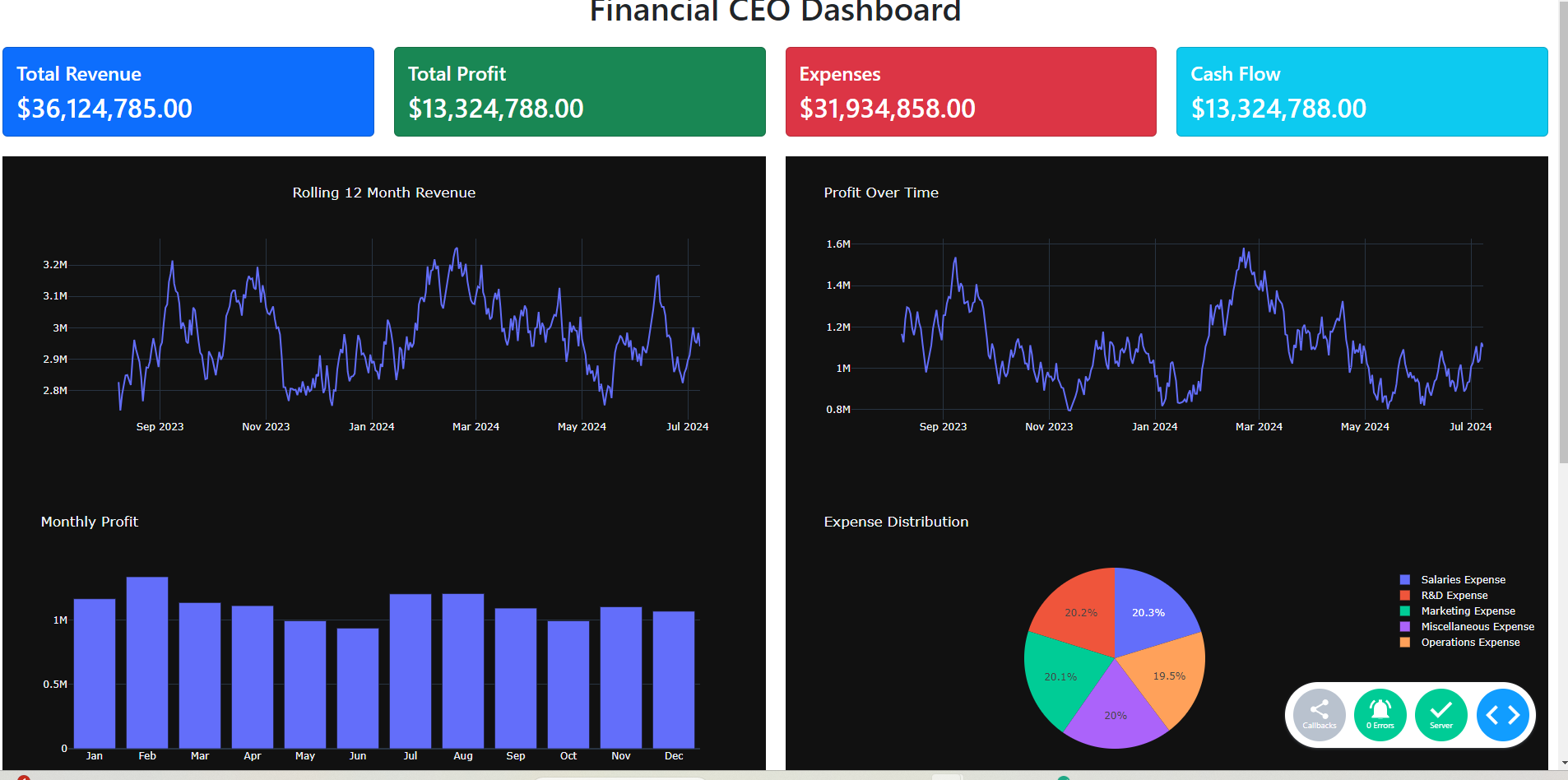
app.layout = dbc.Container([
dcc.Store(id='data', data=data.to_dict('records')), # Store the data
dbc.Row([
dbc.Col(html.H1("Financial CEO Dashboard", className="text-center mb-4"), width=12)
]),
dbc.Row([
dbc.Col(generate_kpi_card("Total Revenue", "$0", "kpi-total-revenue", "primary"), width=3),
dbc.Col(generate_kpi_card("Total Profit", "$0", "kpi-total-profit", "success"), width=3),
dbc.Col(generate_kpi_card("Expenses", "$0", "kpi-expenses", "danger"), width=3),
dbc.Col(generate_kpi_card("Cash Flow", "$0", "kpi-cash-flow", "info"), width=3),
]),
dbc.Row([
dbc.Col(dcc.Graph(id='chart-1', style={"height": "400px"}), width=6),
dbc.Col(dcc.Graph(id='chart-2', style={"height": "400px"}), width=6),
]),
dbc.Row([
dbc.Col(dcc.Graph(id='chart-3', style={"height": "400px"}), width=6),
dbc.Col(dcc.Graph(id='chart-4', style={"height": "400px"}), width=6),
]),
dbc.Row([
dbc.Col(html.Div(id='data-table'), width=12)
])
], fluid=True)
# Define callbacks to update KPI cards with data
@app.callback(
Output('kpi-total-revenue', 'children'),
Input('data', 'data')
)
def update_kpi_total_revenue(data):
df = pd.DataFrame(data)
total_revenue = df['Revenue'].sum()
return f"${total_revenue:,.2f}"
@app.callback(
Output('kpi-total-profit', 'children'),
Input('data', 'data')
)
def update_kpi_total_profit(data):
df = pd.DataFrame(data)
total_profit = df['Profit'].sum()
return f"${total_profit:,.2f}"
@app.callback(
Output('kpi-expenses', 'children'),
Input('data', 'data')
)
def update_kpi_expenses(data):
df = pd.DataFrame(data)
total_expenses = df.filter(like='Expense', axis=1).sum(axis=0).sum()
return f"${total_expenses:,.2f}"
@app.callback(
Output('kpi-cash-flow', 'children'),
Input('data', 'data')
)
def update_kpi_cash_flow(data):
df = pd.DataFrame(data)
cash_flow = (df['Cash Inflow'] - df['Cash Outflow'] ).sum()
return f"${cash_flow:,.2f}"
@app.callback(
Output('chart-1', 'figure'),
Input('data', 'data')
)
def update_chart_1(data):
df = pd.DataFrame(data)
df['Cumulative 12 Month Revenue'] = df.Revenue.rolling(30).sum()
fig = go.Figure()
fig.add_trace(go.Scatter(x=df['Date'], y=df['Cumulative 12 Month Revenue'], mode='lines', name='Revenue'))
fig.update_layout(title="Rolling 12 Month Revenue", template="plotly_dark", title_x=0.5)
return fig
@app.callback(
Output('chart-2', 'figure'),
Input('data', 'data')
)
def update_chart_2(data):
df = pd.DataFrame(data)
fig = go.Figure()
df['Cumulative rolling 30 Day Profit'] = df.Profit.rolling(30).sum()
fig.add_trace(go.Scatter(x=df['Date'], y=df['Cumulative rolling 30 Day Profit'], mode='lines', name='Profit'))
fig.update_layout(title="Profit Over Time", template="plotly_dark")
return fig
@app.callback(
Output('chart-3', 'figure'),
Input('data', 'data')
)
def update_chart_3(data):
df = pd.DataFrame(data)
df['Date'] = pd.to_datetime(df['Date'])
df.set_index(df['Date'], inplace=True)
monthly_profit = df.groupby(df.index.month)['Profit'].sum()
months = ['Jan', 'Feb', 'Mar', 'Apr', 'May', 'Jun', 'Jul', 'Aug', 'Sep', 'Oct', 'Nov', 'Dec']
fig = go.Figure([go.Bar(x=months, y=monthly_profit)])
fig.update_layout(title="Monthly Profit", template="plotly_dark")
return fig
@app.callback(
Output('chart-4', 'figure'),
Input('data', 'data')
)
def update_chart_4(data):
df = pd.DataFrame(data)
expenses = df.filter(like='Expense', axis=1).sum()
fig = go.Figure(data=[go.Pie(labels=expenses.index, values=expenses)])
fig.update_layout(title="Expense Distribution", template="plotly_dark")
return fig
@app.callback(
Output('data-table', 'children'),
Input('data', 'data')
)
def update_data_table(data):
df = pd.DataFrame(data)[::-1]
table_header = [
html.Thead(html.Tr([html.Th(col) for col in df.columns]))
]
rows = []
for _, row in df.head(12).iterrows():
rows.append(html.Tr([html.Td(val) for val in row]))
table_body = [html.Tbody(rows)]
table = dbc.Table(table_header + table_body, bordered=True, dark=True, hover=True, striped=True)
return table
# Run the app
if __name__ == '__main__':
app.run_server(debug=True)
And running our app with python app.py after having installed the necessary requirements, we will get access to the app at the default dash url http://127.0.0.1:8050/